
The Connection Between Social Security Disability Insurance and High Unemployment
In 2009, 7.8 million workers, or 3.9 percent of the working-age population, received Social Security Disability Insurance (SSDI). By 2015, that number had grown to 8.9 million, or 4.4 percent of the working-age population. To put these figures in context, consider the SSDI rate1 was 1.7 percent in 1985. This growth, however, has varied geographically. At the county level, there is a strong, positive relationship between the unemployment rate and the SSDI rate. This relationship, however, cannot explain the increase in the national SSDI rate between 2009 and 2015, when the unemployment rate fell on average and in most counties. Instead, SSDI receipt2 is becoming more concentrated and is highest in places with the worst economic prospects.

Figure 1 shows the strong, positive correlation between county-level SSDI receipt and county-level unemployment rates. We plot data from both 2009 and 2015 to compare current conditions with those at the height of the Great Recession. The regression lines show that the relationship between the unemployment and SSDI rates has only become stronger. From 2009 to 2015 when the national unemployment rate was falling, the unemployment rate also fell in most counties. This is reflected in the figure as a general leftward shift. However, the association between unemployment and disability changed. There were fewer counties with high unemployment rates in 2015, but those with high unemployment had even more SSDI recipients.
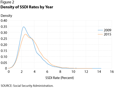
As the national unemployment rate has fallen, high unemployment has corresponded to even higher rates of SSDI receipt. So, the rise in SSDI over this period is a phenomenon associated with increased geographic inequality and an increased concentration of SSDI across counties. Figure 2 shows the distribution of county-level SSDI rates in 2009 and 2015. Visually, the peak has shrunk, which means there are fewer counties with low SSDI levels that resemble the nation as a whole. Instead, that mass has shifted to the tails, and counties with very high rates of disability now have even higher rates.
The two figures suggest that SSDI is associated with economic hardship, but its rise is not a result of increased hardship on average. Instead, the counties that are doing poorly along one economic indicator—unemployment—now fare even worse along another—receipt of SSDI. It is not unreasonable that SSDI should respond to economic conditions: SSDI is actually designed with a set of job-related criteria, and these vocational considerations have been growing as a share of new benefit recipients.3 The set of shocks and conditions driving Figure 1, however, is still a puzzle.
Notes
1 We refer to the SSDI "rate" as the fraction of the working-age population receiving disability insurance payments.
2 Hereafter, the terms "SSDI receipt" and "disability" are used interchangeably.
3 See Michaud, Amanda; Nelson, Jaeger and Wiczer, David. "Vocational Considerations and Trends in Social Security Disability." Working Paper No. 2016-018, Federal Reserve Bank of St. Louis, October 16, 2016; https://research.stlouisfed.org/wp/2016/2016-018.pdf, among others, for more on the joint economic and health criteria for SSDI.
© 2017, Federal Reserve Bank of St. Louis. The views expressed are those of the author(s) and do not necessarily reflect official positions of the Federal Reserve Bank of St. Louis or the Federal Reserve System.