
Geographic Dispersion in U.S. Employment
Employment statistics often receive notable attention as economic indicators during times of stress, such as during the COVID-19 pandemic. In an ever-changing economy, employment varies significantly across the more than 3,000 counties in the United States. Most employment is concentrated in a few areas, with large areas of little employment in between.
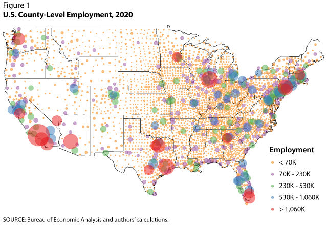
Figure 1 uses 2020 nonfarm payroll employment data from the Bureau of Economic Analysis to exhibit this phenomenon. Each point represents a county, and points are sized and colored to indicate a share of total U.S. employment. We order the counties by employment share and then split them so that the sum of employment represented by each color is approximately 20% of total U.S. employment. We see clusters of counties with high employment on the coasts, specifically in the northeast and southwest, with other sizable clusters spread out across the U.S. However, between these counties are thousands more with very little employment. Of the more than 3,000 counties, only a small fraction contain the majority of employment, and the counties with higher employment are typically clustered in larger, regional groupings: Eighteen counties account for 20% of employment, and 112 counties account for 50% of employment.1
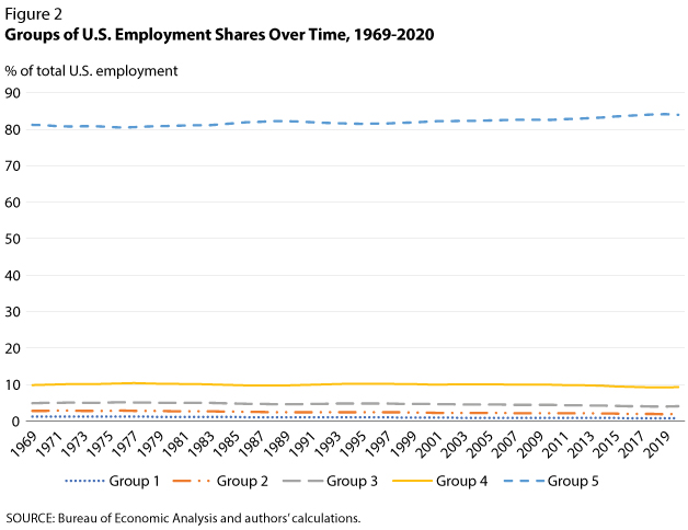
Figure 2 offers a different view of employment shares in counties over time. We order the counties by employment share and split them into five groups, reordering and regrouping each year. Each group contains 20% of the total counties in the U.S.; that is, each group has about 621 counties. For example, the blue line represents the 621 counties that made up 81% of total employment in 1970. This number increased to 84% in 2020. The employment shares in other county groups changed slightly—less than 1% each from 1970 to 2020.
Although there were not large changes in each group's overall employment shares, there were significant shifts in which counties held the biggest shares over time. The top five largest counties in terms of employment share in 1970 were Los Angeles, CA, Cook, IL, New York, NY, Wayne, MI, and Philadelphia, PA. These five counties made up 12% of total U.S. employment. By 2020, Wayne, MI, and Philadelphia, PA, were not even in the top 15. The top five counties in 2020 made up 9% of total employment, and Wayne and Philadelphia were replaced by Harris, TX, and Maricopa, AZ.2
Of note is the concentration of employment in California, Texas, and Florida, which increased over time. In 1970, 15 counties made up 20% of overall employment in the U.S., and one third of these counties were in California, Texas, and Florida. In 2020, 18 counties made up 20% of overall employment, and over one half of those counties were in California, Texas, and Florida.
Overall, whether employment concentration has experienced an increase or decrease depends on the way we measure it. For example, the number of counties making up 20% of employment increased from 15 in 1970 to 18 in 2020, implying that concentration decreased. However, the employment share of the top 20% of counties increased from 81% to 84% from 1970 to 2020, implying that the concentration increased. Continued analysis of employment concentration in U.S. counties will provide valuable insight into the evolving U.S. economy.
Notes
1 Economic output and population are also similarly unevenly distributed. See Ravikumar, B. and Reinbold, Brian. "Geographic Disparity in U.S. Output." Federal Reserve Bank of St. Louis Economic Synopses, 2020, No. 5; https://research.stlouisfed.org/publications/economic-synopses/2020/03/06/geographic-disparity-in-u-s-output; and Ravikumar, B. and Mather, Ryan. "Geographic Disparity in the U.S. Population." Federal Reserve Bank of St. Louis Economic Synopses, 2020, No. 27; https://research.stlouisfed.org/publications/economic-synopses/2020/05/06/geographic-disparity-in-the-u-s-population.
2 Wayne, Harris, and Maricopa counties refer to the Detroit, Houston, and Phoenix metros, respectively.
© 2022, Federal Reserve Bank of St. Louis. The views expressed are those of the author(s) and do not necessarily reflect official positions of the Federal Reserve Bank of St. Louis or the Federal Reserve System.