The Evolution of St. Louis’s Wage Distribution
Income inequality is at the forefront of many policy discussions. Wage inequality, in particular, fuels debate over increasing the minimum wage in St. Louis, where the state legislature has overturned the city's recent increase to a $10 per hour minimum wage.1 This debate has raised questions about the wage distribution in the St. Louis metropolitan statistical area (MSA).
We analyze the Bureau of Labor Statistics (BLS) annual Occupational Employment Statistics (OES) data, which contain mean, median, and percentile wages for the nation, states, and MSAs.2 We find that wage inequality in the St. Louis MSA is below the national average but has increased in recent years, in parallel with the evolution of inequality at the national level.
St. Louis Wage Inequality Compared with the Nation's
In May 2016, the average hourly wage in the St. Louis MSA was $23.19, while the median hourly wage was $17.83, values close to the respective U.S. wages of $23.86 and $17.81. The top 10 percent (90th percentile) of workers in the St. Louis MSA earned an average of $42.93, about 6 percent lower than the analogous national average of $45.45.3 The average hourly wage of the bottom 10 percent (10th percentile) was $9.03 in the St. Louis MSA and $9.27 nationally. Management was the highest-paid broad occupation group in the MSA, with a mean wage of $55.02 and a median of $47.37, while food preparation and serving was the lowest, at $10.58 and $9.31, respectively.
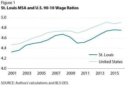
A useful way to study the evolution of inequality over time is to compare the wages of the top 10 percent of workers with the bottom 10 percent of workers (the 90-10 ratio) over a 15-year period. If all incomes increased proportionally over the period, the ratio would remain unchanged. However, if incomes in the 90th percentile grow faster (slower) than those in the 10th, the ratio would increase (decrease).

Figure 1 shows the 90-10 ratio for the St. Louis MSA and the nation from 2001 to 2016. The ratio started at around 4.3 in 2001. That is, workers in the 90th percentile earned on average 4.3 times as much per hour as workers in the 10th percentile in 2001. Although the ratio decreased modestly during the recession, it has increased over time and stood at about 4.75 in 2016. This ratio is still lower than the national average, however, indicating less wage inequality than for the nation as a whole.

Uneven Wage Growth in the St. Louis MSA
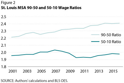
Other income ratios can be helpful for identifying what is driving the wage inequality: higher wages at the top or lower wages at the bottom. Figure 2 shows the ratios of the 90th percentile to the median (the 90-50 ratio) and the median to the 10th percentile (the 50-10 ratio) for the St. Louis MSA. Wages of high-wage earners have risen steadily faster than those of the median worker. The Great Recession does not appear to have influenced this upward trend. In contrast, the 50-10 ratio indicates that the wages of the median worker rose slightly from 2001 to 2007 but declined after 2007. The overall trend is flat.
The divergence of these ratios indicates two key points: First, increased inequality in the St. Louis MSA is primarily due to gains at the very top of the distribution. Second, the lowest-wage workers have gained on the median worker since 2007.

Wage Disparities Within Occupations
While some inequality is due to wage differences within the same occupation, wage differences across occupations are the primary factor. Figure 3 shows the distribution of 90-10 ratios within the 552 OES detailed occupation groups in the St. Louis MSA.4 That is, this graph shows the distribution of within-occupation inequality. Most of the ratios are between 1 and 4, with an average of 3.2, about two-thirds of the aggregate ratio of 4.7, which suggests that inequality between occupations is greater than inequality within occupations. In fact, inequality between occupations can be substantial: The median wage for lifeguards is $8.91 per hour, while that for physicians and surgeons is $99.82 per hour. The greatest within-group inequality ratios tend to be in sales occupations, which often have commission-based incentives: financial services sales agents (7.2), real estate brokers (7.1), and musicians and singers (6.8). Low-wage occupations tend to exhibit the least within-occupation inequality ratios: lifeguards (1.3), cooks (1.4), and personal care aids (1.4).
Research on Polarization
The increase of employment in high- and low-skilled jobs and the decline of employment in middle-skilled jobs is called job polarization and is often cited as a cause of the increase in wage inequality.5 The results in Figure 2 are consistent with job polarization: As demand for mid-skill occupations declines and wage growth slows for them, the gap widens between mid-skill and high-skill jobs and shrinks between mid-skill and low-skill jobs.
Notes
1 The population of the city of St. Louis is 311,000, while that of the St. Louis MSA is 2.9 million. See Eubanks, Daniel and Gascon, Charles. "What Could We Have Expected from a $10 Minimum Wage in the City of St. Louis?" Federal Reserve Bank of St. Louis Economic Synopses, No. 8, 2017; https://research.stlouisfed.org/publications/economic-synopses/2017-05-23/what-could-we-have-expected-from-a-10-minimum-wage-in-the-city-of-st-louis/.
2 The OES wage measure excludes overtime pay and year-end bonuses but does include tips and commissions. For more information, see https://www.bls.gov/oes/oes_ques.htm.
3 It is important to distinguish between high wages and high incomes. Because high-income individuals will have significant non-wage income from other sources (i.e., capital gains), wage inequality may understate overall income inequality.
4 While management occupations have the highest mean and median wages, the 90th percentile wage is not provided, so this occupation group is not included in the table.
5 See Dvorkin, Maximiliano and Shell, Hannah. "Labor Market Polarization: How Does the District Compare with the Nation?" Federal Reserve Bank of St. Louis The Regional Economist, July 2017, 25(2), pp. 22-23; https://www.stlouisfed.org/~/media/Publications/Regional-Economist/2017/Second_quarter_2017/district_overview.pdf.
© 2017, Federal Reserve Bank of St. Louis. The views expressed are those of the author(s) and do not necessarily reflect official positions of the Federal Reserve Bank of St. Louis or the Federal Reserve System.


 follow @stlouisfed