
How Have Shanghai, Saudi Arabia, and Supply Chains Affected U.S. Inflation Dynamics?
Posted 10/25/2018
This article is based on the Homer Jones Memorial Lecture delivered at the Federal Reserve Bank of St. Louis, May 16, 2018.
Abstract: Understanding and forecasting inflation has always been a key focus of macroeconomics and monetary policymaking. Historically, many macroeconomists and central banks have relied on the "Phillips curve" framework for this purpose. Recently, however, the Phillips curve framework has not been performing well. This article examines a number of possible explanations for the breakdown of the "Phillips curve" relationship between slack and inflation. These explanations include the possibility that the curve may have flattened or shifted, that standard measures may not be capturing key aspects of the relationship, or that a series of "unfortunate" and unprecedented events may have obscured the underlying relationship. Each of these explanations has some merit and support, but each seems unable to explain how inflation dynamics have evolved over the past decade. This article suggests that what is missing is a more comprehensive treatment of how globalization has affected domestic prices, through channels such as increased trade flows, the greater economic heft of emerging markets, and increased ease of using global supply chains to shift parts of production to cheaper locations. This greater role for globalization in explaining inflation, however, does not mean that the standard Phillips curve framework is "dead." Rather, macroeconomists and monetary policymakers should update their existing models in two key ways: to include global parameters more explicitly and allow these parameters to adjust over time with the world economy.
INTRODUCTION
Understanding and forecasting inflation has always been a key focus of macroeconomics—and central for institutions setting monetary policy. Recently, however, the basic frameworks and models used to understand inflation have not been performing very well. When the global Financial Crisis hit in 2008 and growth collapsed around the world, why didn't inflation fall further? How did the world avoid a period of deflation, as occurred during the synchronized collapse in global economic output during the Great Depression? And more recently, as gross domestic product (GDP) growth has picked up in most advanced economies and unemployment has fallen—reaching record lows in some—why has inflation remained so low? Is this a sign of deep-seated vulnerabilities, such as the "secular stagnation" that was the theme of Larry Summers's (2016) recent Homer Jones lecture?
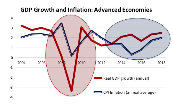
Figure 1: A Puzzle?
SOURCE: Based on data from the IMF (2018).
Figure 1 shows these puzzling patterns in a graph of annual real GDP growth and consumer price index (CPI) inflation for advanced economies. Why have the fluctuations in GDP growth over the past 15 years seemed to have so little effect on prices? There has been no shortage of speeches, commentary, and economic research trying to understand this disconnect. One of my favorite titles was "And Yet it Moves"—a reference to Galileo's famous quote "Eppur si muove"—that he used when arguing that the earth moved around the sun. And just as the earth actually does move, the past few years have highlighted that inflation also moves, albeit not necessarily in the ways that our models have predicted.

Figure 2: Distribution of CPI Inflation Rates in Advanced Economies
NOTE: Based on average annual inflation.
SOURCE: Based on data from the IMF (2018).
A closer look at the distribution of CPI inflation rates in advanced economies (Figure 2) clearly shows this movement. Although the global economy has grown above 2 percent per year each year since 2009—and averaged growth of about 2 3/4 percent in 2014-15—CPI inflation was below 1 percent in over half of the advanced economies in 2014, 2015, and 2016. In 2015, CPI inflation was below 1 percent in over 80 percent of advanced economies and below zero (deflation) in over 30 percent. This is a sharp change from inflation hovering around 2 percent for much of the decade before the crisis. This is also a sharp change from 2008, when over 80 percent of the advanced economies had inflation over 3 percent.

Figure 3: Another Concern—Core Inflation in Advanced Economies
SOURCE: IMF (2018, Figure 1.6).
Granted, optimists may focus on the last bar in the graph (for 2017), which suggests that the period of undesirably low inflation may be ending. In 2017, although inflation was still lower than many central banks' targets, it averaged between 1 percent and 3 percent for about 80 percent of the advanced economies. A meaningful part of this recovery in headline inflation rates, however, reflects a temporary boost from higher energy prices. What happens when energy prices stabilize? As the International Monetary Fund (IMF) highlighted in its April 2018 World Economic Outlook (Figure 3), core inflation, which tends to be a better determinant of underlying and sustainable inflation rates, is still only averaging about 1 1/2 percent in advanced economies. There is still a lack of underlying inflationary pressures, despite unemployment being at the lowest level in a decade in many countries and below what is believed to be the NAIRU (non-accelerating inflation rate of unemployment) in a number of major economies.
What is perhaps most disconcerting for economists is the seeming breakdown of traditional models and economic relationships that are assumed to underpin the inflation process. Most prominent is the apparent breakdown of the Phillips curve. Throughout this article, I will use the term "Phillips curve" relationship broadly—not just to capture the relationship between unemployment and wage growth shown by William Phillips in his original curve—but instead to capture the more general relationship between the amount of slack (or spare capacity) in the economy and price inflation. There are a number of ways of measuring these concepts, details I'll get into below. But the basic concept is intuitive and at the core of most models of inflation. When most people who want to work are working, and there is little spare capacity in an economy, resource constraints tend to drive up wages and prices.

Figure 4: Model Breakdown?
NOTE: OECD, Organization for Economic Co-operation and Development.
SOURCE: Economist.com. "The Phillips Curve May Be Broken for Good." Daily Chart, November 1, 2017. © The Economist Group Limited, London (2017).
This Phillips curve relationship may sound obvious but has recently been hard to see in the data. Figure 4 shows a recent graph from The Economist that makes this point. The dots show one variant of this Phillips curve relationship—the relationship between cyclical unemployment and core inflation in advanced economies since the 1970s. The expected negative relationship between these measures of slack and unemployment existed from 1975-84 (the dark blue dots), but then weakened over the subsequent decade (the light blue dots), and further faded during the most recent period (the yellow dots). The relationship has recently been so weak that it almost disappears—or "flatlines"—so that the heading for the graph chosen by The Economist was "The Phillips curve may be broken for good."
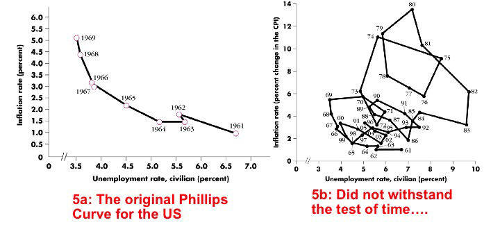
Figure 5: Model Breakdown
SOURCE: Dornbusch, Rudiger; Fischer, Stanley and Startz, Richard. Macroeconomics. 10th Edition. Chapter 6. McGraw Hill, 2008, pp. 124 and 126. ©McGraw-Hill Education.
Granted, this is not the first time that there has been soul searching about the accuracy of the Phillips curve. Figure 5A shows an early variant of the Phillips curve—graphed for the United States just as the concept became popular at the end of the 1960s. This clearly shows the expected negative relationship between unemployment and wage inflation. Figure 5B, however, shows what happened to this relationship over the next few decades. The Phillips curve appeared even more "broken" than today.
These earlier breakdowns, however, were quickly explained with modest extensions to the framework—such as controlling for oil price shocks (or other supply shocks) that caused the Phillips curve to shift. More recently, concerns that the Phillips curve framework is no longer "fit for purpose" are more deep-seated. A Google search for articles that include the terms "dead" and "Phillips curve" yields over 1,000 hits. Is the Phillips curve framework broken for good?
This is the key theme that I will explore in the rest of this article. Has something changed so that the framework central for thinking about inflation dynamics is no longer useful? Have changes in the global economy—in Shanghai (i.e., emerging markets), in Saudi Arabia (i.e., oil and commodity markets), and in supply chains (i.e., production processes)—affected inflation dynamics? If these changes in the global economy are incorporated into our frameworks for understanding inflation—do the old relationships still apply? Can we simply extend our old frameworks rather than throw them away?
In order to answer these questions, the remainder of the article is divided into four sections. Section II briefly summarizes key arguments why the Phillips curve framework may appear broken today. Section III proposes an alternative explanation: the need to add a more comprehensive treatment of changes in the global economy. Section IV provides some empirical evidence to support the growing role of international factors and globalization in explaining inflation dynamics. Section V concludes, tying together the pieces of evidence that suggest a better incorporation of the roles of "Shanghai, Saudi Arabia, and Supply Chains" can go some way toward improving our understanding of recent inflation dynamics.
Read the full article.